A bit of UX research before scrapping a homepage
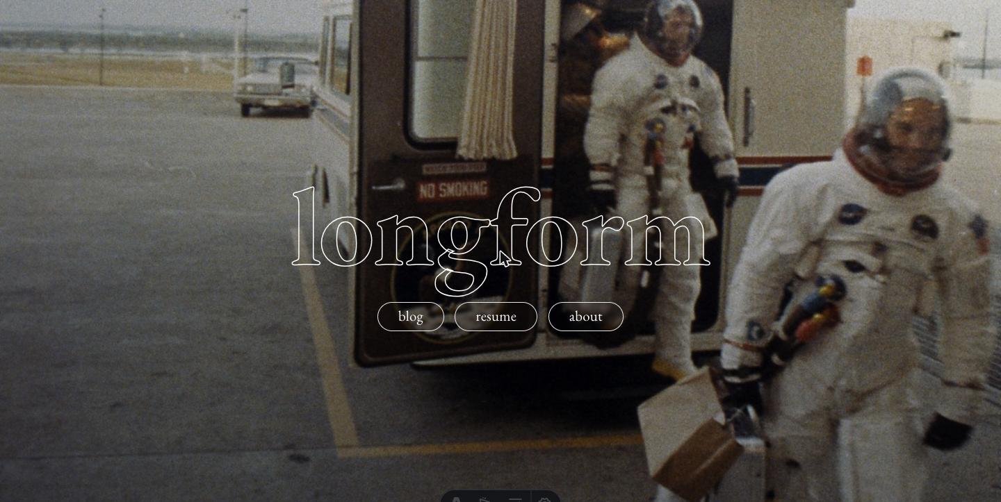
I built a hero homepage two weeks ago. A photo of the Apollo 11 crew stepping out of the transfer van, “longform” centered in hollow EB Garamond, three pill nav buttons. It looked striking. I’ve since scrapped it. This is the research that pushed me to.

What I was optimizing for
The hero version was about identity, not utility. I wanted the homepage to read as a piece of design, not a navigational index. The argument I made to myself was that a personal site is a calling card, and the first impression should be the version of me a stranger encounters before they decide to read anything.
The argument against was harder to articulate at first, which is usually a sign there’s something to it. So I went looking.
How fast users actually judge a page
The first thing the literature surfaces is just how compressed the decision window is.
A 2006 paper by Lindgaard, Fernandes, Dudek and Brown ran three controlled studies on first impressions of web pages. Lindgaard, Fernandes, Dudek and Brown, “Attention web designers: You have 50 milliseconds to make a good first impression!” Behaviour & Information Technology 25(2), 2006, pp. 115-126. Roughly 1,000 citations on Google Scholar; the 50 ms condition is in Study 3. In the third study, participants rated the visual appeal of homepages shown for just 50 milliseconds. The ratings correlated strongly with ratings of the same pages shown for 500 ms, which themselves correlated with ratings over normal viewing time. The paper’s claim, captured in its title, is that visual appeal is judged in around 50 ms. That’s a tenth the time it takes to blink, and well below conscious deliberation.
Visual appeal is not the same as deciding whether to stay. For the stay-or-go decision, Nielsen Norman Group’s 2011 analysis of session-duration data found a much larger but still tight window. Their study pulled dwell-time measurements from 205,873 web pages with at least 10,000 visits each, over two billion data points total, and fit a Weibull distribution to the results. Jakob Nielsen, “How Long Do Users Stay on Web Pages?” Nielsen Norman Group, Sept. 12, 2011. Analysis of 205,873 web pages with 10,000+ visits each, over 2 billion total dwell-time measurements, fit to a Weibull distribution. 99% of pages showed negative aging: the longer a user stays the lower their probability of leaving. The pattern: users have an extremely high probability of leaving in the first few seconds, that probability drops off sharply if they’re still there at 10 seconds, and pages that retain users for 30 seconds tend to retain them for two minutes or more.
The decision windows a homepage has to clear
Three thresholds from the UX research, with very different stakes. The first one is settled before a visitor has consciously read anything; the third is the one that actually correlates with reading the work.
The implication is uncomfortable for anyone who builds atmospheric homepages: the visual hit happens before any cognitive evaluation, but the stay-or-go decision is driven by perceived value, and that value has to be legible in around 10 seconds. A pretty hero buys you the first window. It doesn’t buy you the second.
What banner blindness does to large hero areas
The other piece of UX literature that matters here is banner blindness. The term came from a 1998 study by Benway and Lane that found web searchers missed “obvious” links presented in banner-style placements, even when the banners contained information the participants were actively looking for. Benway and Lane, “Banner Blindness: Web Searchers Often Miss ‘Obvious’ Links,” Internetworking 1.3, Dec. 1998. The originating empirical observation; users searching for specific content on a study page failed to notice clearly labeled links presented in banner positions. The effect has been replicated repeatedly over the next 25 years, including in eye-tracking work.
The most relevant recent study is Kara Pernice’s 2018 eye-tracking research at Nielsen Norman Group. Kara Pernice, “Banner Blindness Revisited: Users Dodge Ads on Mobile and Desktop,” Nielsen Norman Group, April 22, 2018. 26-participant eye-tracking study; the 0.8% right-rail attention figure is the central quantitative finding. It used 26 participants on task-based browsing and produced two findings that bear directly on hero homepages:
- The right rail of a typical page took up roughly 25% of the horizontal real estate but received only about 0.8% of users’ visual attention. That’s a 33-fold reduction in fixations relative to a proportional baseline.
- Users skipped the ad-styled result at the top of Google search even when its visual design was nearly identical to organic results. The skip was a learned reflex, not an aesthetic objection.
A hero image doesn’t sit in a right rail and isn’t an ad. But it shares the most predictive feature: it occupies a lot of space and doesn’t look like content. The eye-tracking evidence is that users have learned to skip exactly those regions. Putting your value proposition inside one is a bet against well-replicated user behavior.
Carousels, which are the worst-case version of this
The clearest single piece of data I found is Erik Runyon’s 2013 study of the carousel on the University of Notre Dame’s homepage. Erik Runyon, “Carousel Interaction Stats,” erikrunyon.com and Notre Dame web team, January 2013. Google Analytics events on the ND.edu homepage carousel and four other Notre Dame sites, mid-October 2012 through January 22, 2013. He instrumented the carousel with Google Analytics events and tracked interactions over several months. The headline finding: only about 1% of homepage visitors clicked the carousel at all, and of those who did, 84% clicked on the first slide. Slides two through five split the remaining 16% between them.
Where carousel clicks actually land
Of the ~1% of homepage visitors who clicked the Notre Dame carousel at all, the first slide absorbed almost all of the activity. Slides 2 through 5 split a sliver.
A hero photo isn’t a carousel, but the carousel result generalizes. Visitors don’t dig through decorative homepage real estate looking for things. Whatever you put after the first thing they see is, statistically, almost not there.
A useful corollary from the same study: across the five Notre Dame sites Runyon tracked, average click-through rates on the carousel ranged from 1.7% to 2.3%, with the top-slot click taking 48% to 62% of the total. The more slides he added, the worse the engagement on each one.
Page speed, which is the other half of the hero cost
Hero images are large. Mine were roughly 280 KB desktop and 180 KB mobile. That sounds modest until you look at what the load-time research says about user behavior.
The most-cited figure here comes from Google’s 2017 DoubleClick study of mobile site speed: 53% of mobile users leave a site that takes more than three seconds to load. Google / DoubleClick, “The Need for Mobile Speed: How Mobile Latency Impacts Publisher Revenue,” 2017. Source for the 53% mobile-abandonment-above-three-seconds figure that’s been quoted nearly everywhere since. A separate finding in the same research line, often quoted by Akamai, is that each one-second delay in mobile page load correlates with a 7% drop in conversion. Across the broader range from one second to ten seconds, Google’s modelling suggested mobile bounce probability increased by 123%. Daniel An (Google), “Find Out How You Stack Up to New Industry Benchmarks for Mobile Page Speed,” Think With Google, March 2017. Includes the bounce-probability-by-load-time modelling underlying the chart above; the 123% figure compares one-second loads against ten-second loads.
How mobile bounce probability scales with load time
The shape of the relationship, drawn from Google's mobile speed research. The threshold is between roughly one and three seconds. After that, the curve gets ugly fast.
A 280 KB image isn’t the difference between 1 s and 10 s on a modern connection. But it’s not nothing on a 4G handoff in a rural area or on an older phone. And the cost compounds: the hero is loaded on every cold visit, even for repeat readers who came back for the new post.
Where the evidence base actually thins out
All of the work above is strongest for commercial sites. Lindgaard’s stimuli were generic web pages and her panel was university students. Pernice’s banner-blindness eye-tracking was task-based and the right-rail finding came from a 25%-vs-content comparison on news-style layouts. Runyon’s carousel data is from university marketing sites. Google’s mobile-speed numbers come from e-commerce and lead-gen funnels.
A personal site isn’t selling anything. “Conversion” doesn’t really apply. The closest thing to a meaningful failure mode is a visitor bouncing without reading.
For personal sites specifically, the academic literature thins out fast. What’s left is convention. Two camps:
- Atmospheric heroes are the norm among designers, photographers and creative professionals whose homepage is itself a portfolio piece. The hero is the work.
- Content-first homepages dominate among engineers, writers and researchers. Gwern, Sive.rs, Dan Luu, Patrick Collison, and most academic personal sites converge on the same layout: a short intro, a list of writing, links elsewhere.
I had myself in the first category by default because the site looked good. Looking at the writers and engineers I actually return to, I’m closer to the second. The hero version was solving for a problem (impressing first-time visitors) that wasn’t really mine to solve, while introducing problems (search visibility, repeat-visitor cost) that I had to live with.
The specific tradeoffs I was buying into
Three concrete problems with the hero version, in declining order of severity.
SEO. My old / was a list of blog posts with dates. Search engines liked that. Each post URL got an internal link from the homepage with anchor text matching the post title. Recency was readable from the dates. The hero / had a wordmark and three nav buttons. There was no crawlable text content, no recency signal, no internal-link weight flowing to any post. As someone who does SEO for a living, this is a thing I should have flagged in the spec phase. I traded a working landing page for a poster.
Repeat-visitor friction. A returning reader wants the new post, not the Apollo crew. The hero adds a click. Small but real. Cumulatively it’s the same dynamic as Runyon’s carousel: visitors who already know the value of the site shouldn’t have to dig through decoration to access it.
Mobile load. As above. The hero PNG and the rest of the hero CSS added roughly 250 KB to the homepage. Within Google’s comfortable speed budget for a desktop visitor on broadband. Less comfortable on a phone over a flaky LTE signal.
None of these were dealbreakers in isolation. Together they meant the hero was bleeding small amounts of attention for no offsetting gain.
What I changed to
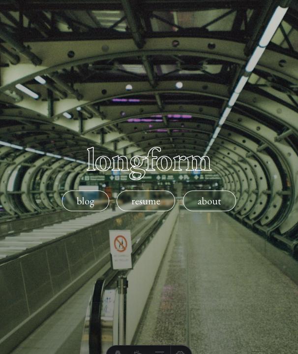
The new / is a content listing. A one-line intro paragraph, the eight most recent blog posts with dates, a link to the full blog index. The atmospheric photo I liked is archived in this post, as the screenshots at the top.
Concretely: the site-header that used to be hidden on the hero is back at the top of every page. Page weight on / dropped by roughly 250 KB. Crawlable text on the homepage went from a wordmark to about 600 words of varying post titles. The recency signal for search engines is restored.
What I’ll watch
If I’m wrong about any of this I want to know. Two metrics over the next month in Cloudflare Web Analytics:
- Bounce rate on
/. Under roughly 65% is fine for a personal site. Over 75% means the new homepage isn’t doing what I think it is. - Click-through rate from
/to/blog/*. I want this north of 30% for visitors who don’t bounce. The whole point of the change is that the recent posts list does the work the hero buttons were doing, but better.
If the numbers are bad I’ll revisit. The deeper lesson sits below the metrics: I’d built something I liked the look of and reasoned about it backwards. The discipline of asking “what would I tell a client to do” before “what would I prefer” applies to my own site too.